Architecture websiteArchitecture2025

make_

A redesigned portfolio for an award-winning architecture studio
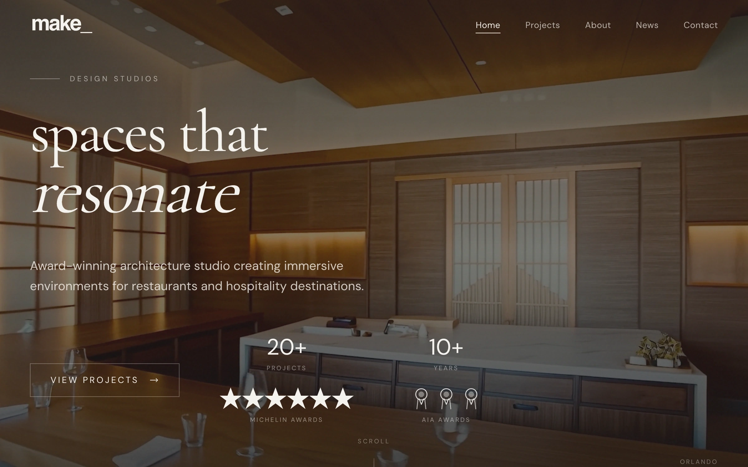
make_ homepage: “spaces that resonate” over a full-bleed photograph of a restaurant interior

make_ is a mature architecture and interiors studio in Orlando, Florida. Its work was already excellent; its website undersold it. The brief was repositioning: a site that would read as premium to the higher-end clients the studio wanted to win, and that would justify the rates the work deserves.

The answer was editorial. Full-bleed photography, a light grotesk paired with an italic serif for the lines that matter, generous white space, and a ruled grid of featured projects that lets the rooms speak. Each project page opens on the space itself, then walks through it. Interactions are smooth and few.

The brand strategy and design system came first; the site is their most visible expression. Since launch the studio reports higher-quality inbound leads and a portfolio that is a pleasure to move through.
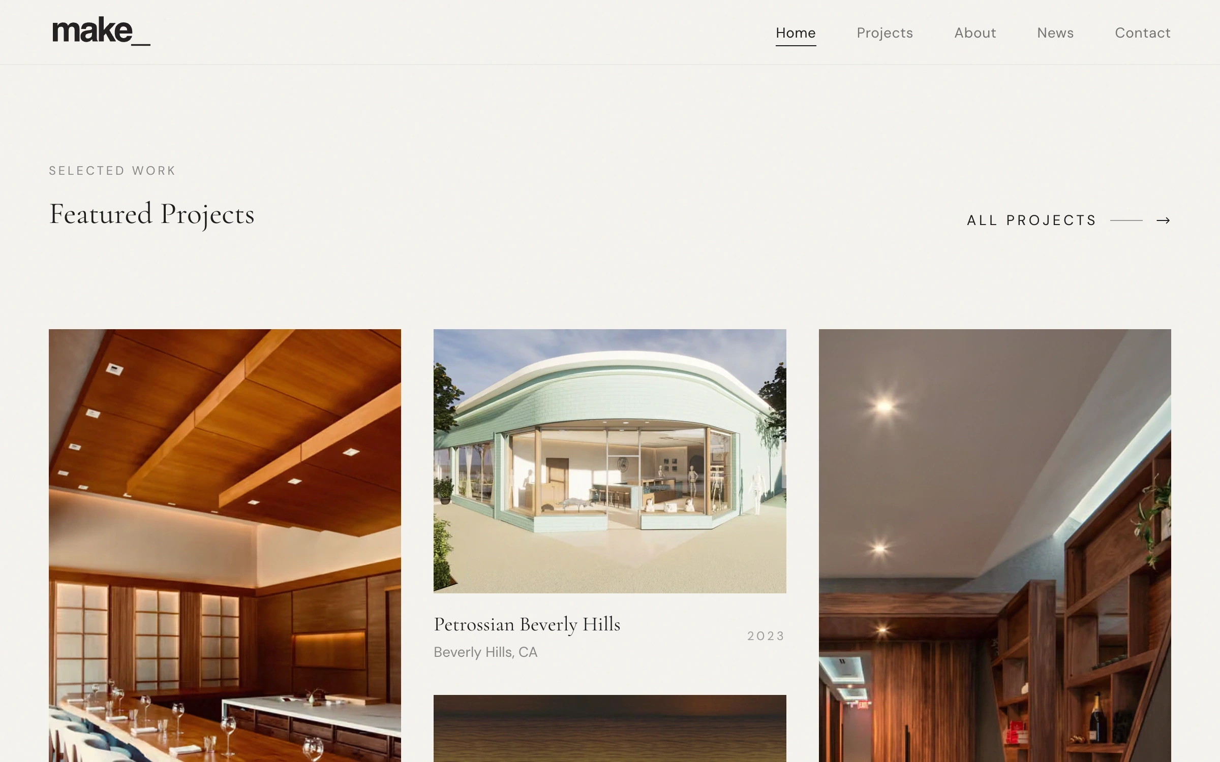
Featured projects in a ruled grid of interior photographs
02Featured projects. The grid is ruled; the photography does the rest.
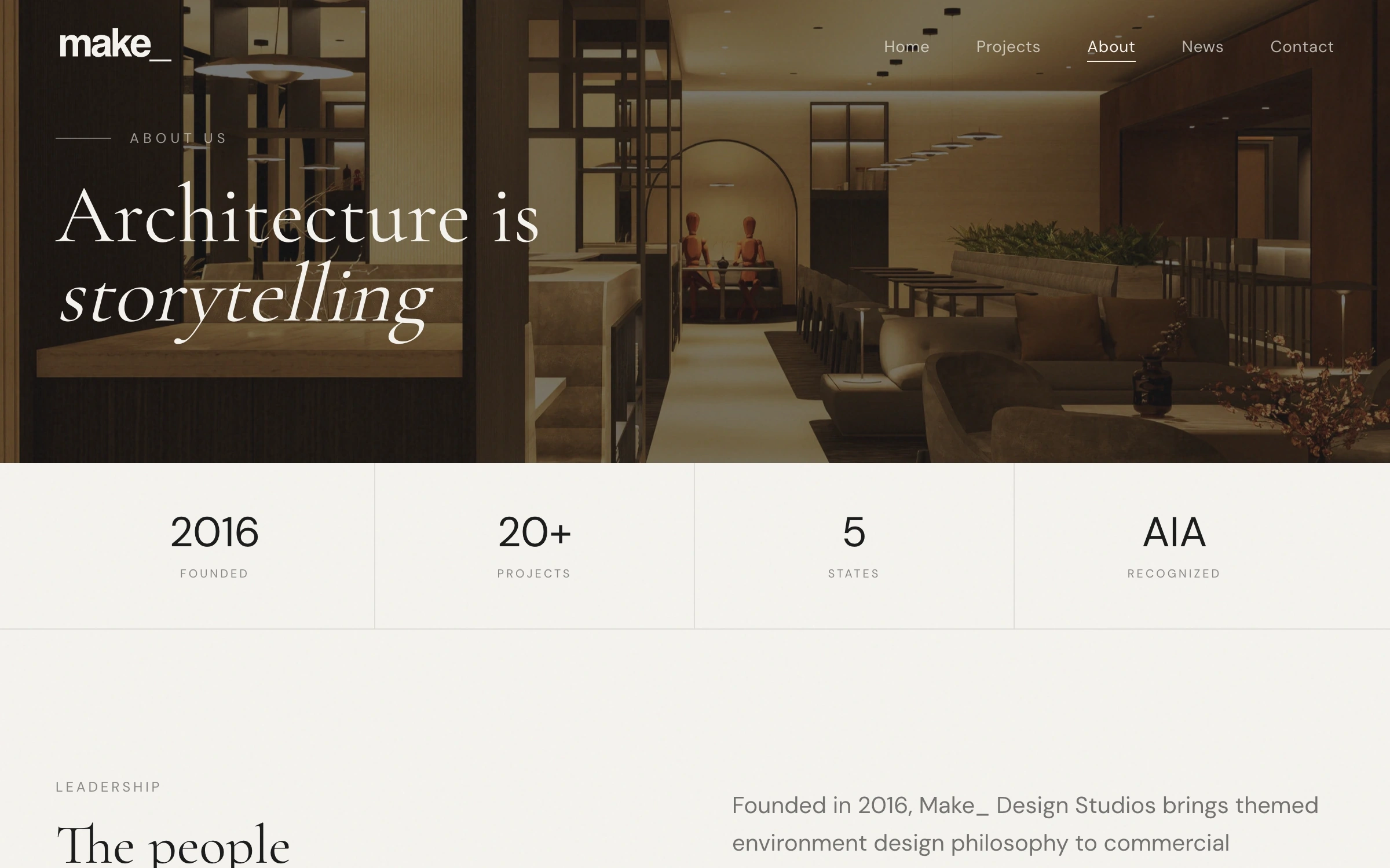
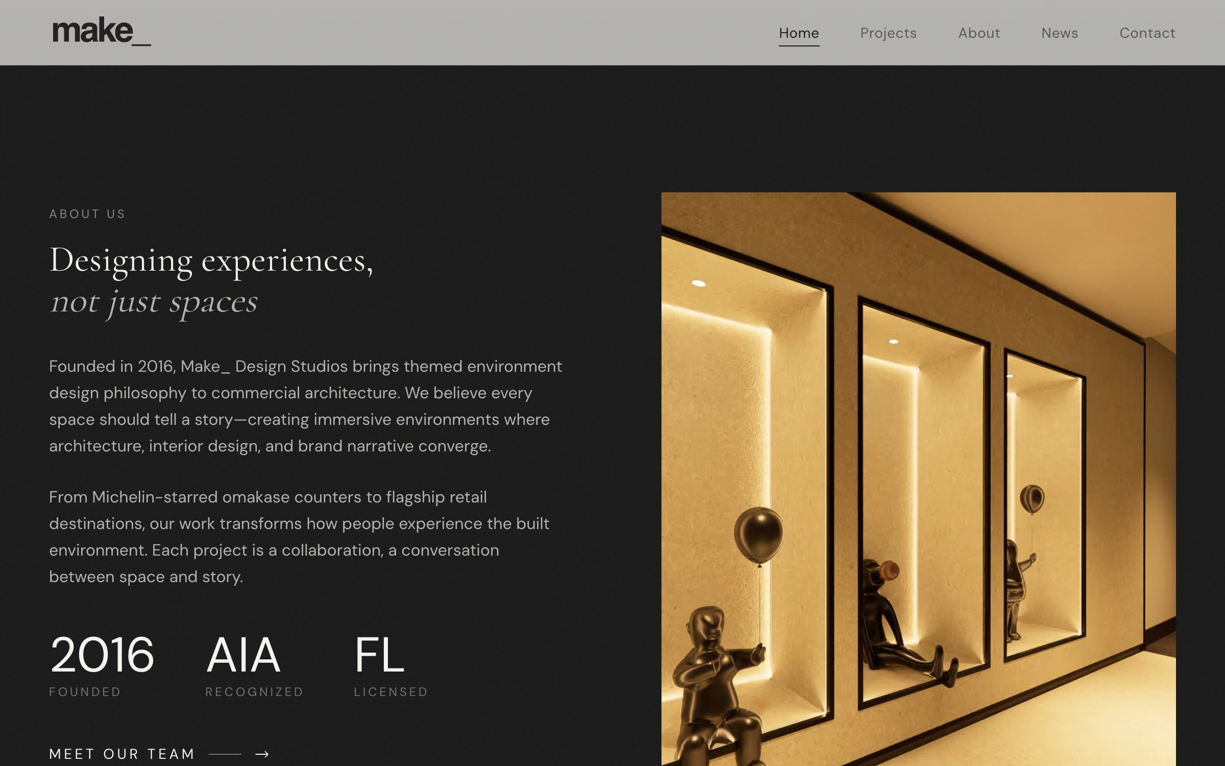
“Designing experiences, not just spaces”, with the studio’s founding year, its AIA membership and Florida
03The studio’s story in a few lines, with its founding year and AIA membership as quiet facts.
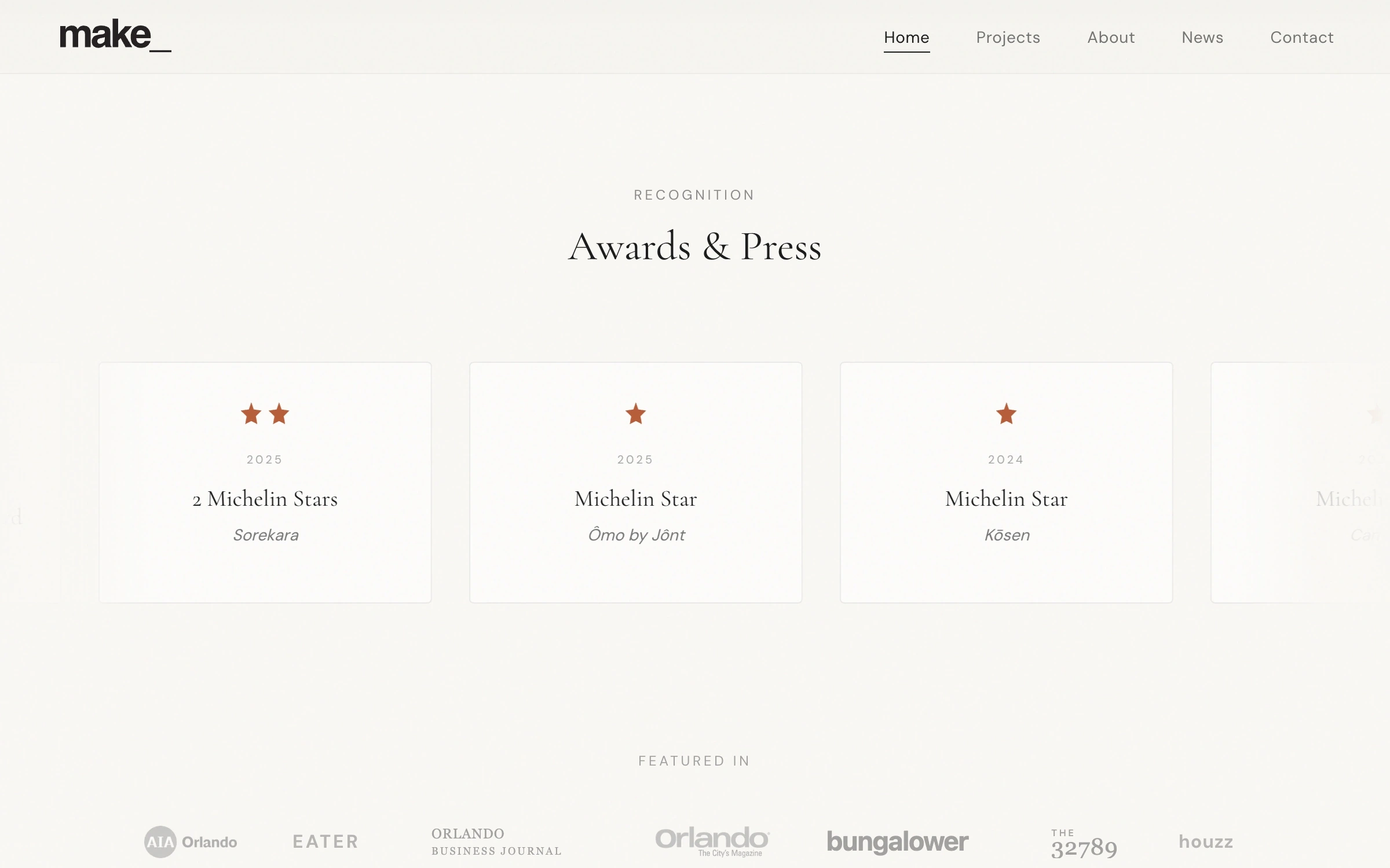
“Awards & Press”: Michelin stars for Sorekara, Ōmo by Jônt and Kōsen, and the publications the studio has appeared in
04The awards: Michelin stars for the restaurants the studio designed, and the press.
The about page: “Architecture is storytelling” over a dark interior
05The about page opens on a line and a room.
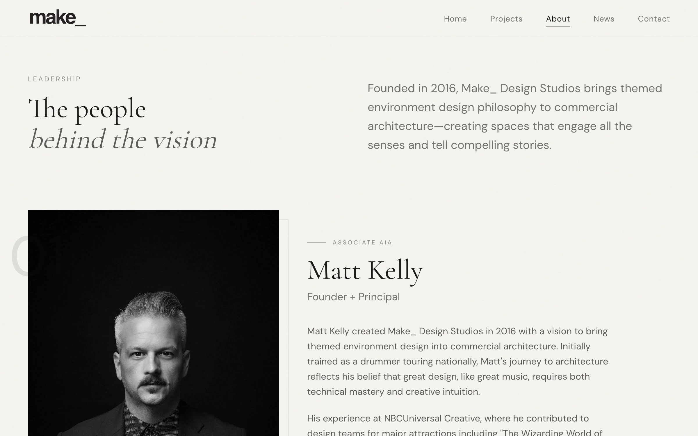
“The people behind the vision”: a black-and-white portrait of Matt Kelly, founder and principal
06The people page: black-and-white portraits and room to read.
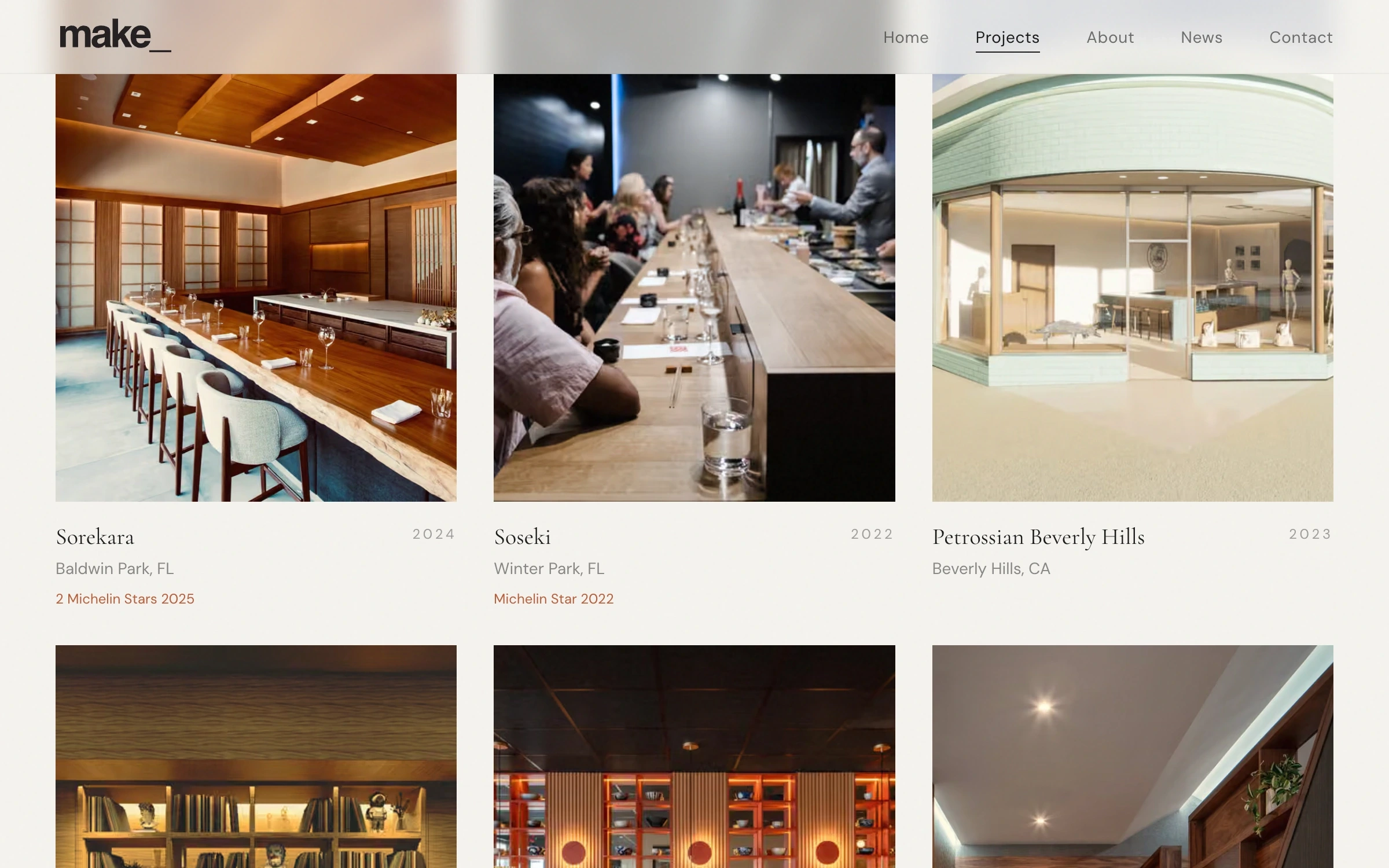
The projects page: Sorekara, Soseki and Petrossian Beverly Hills in a ruled grid with their years
07The projects page, filterable by type, each project with its place and year.
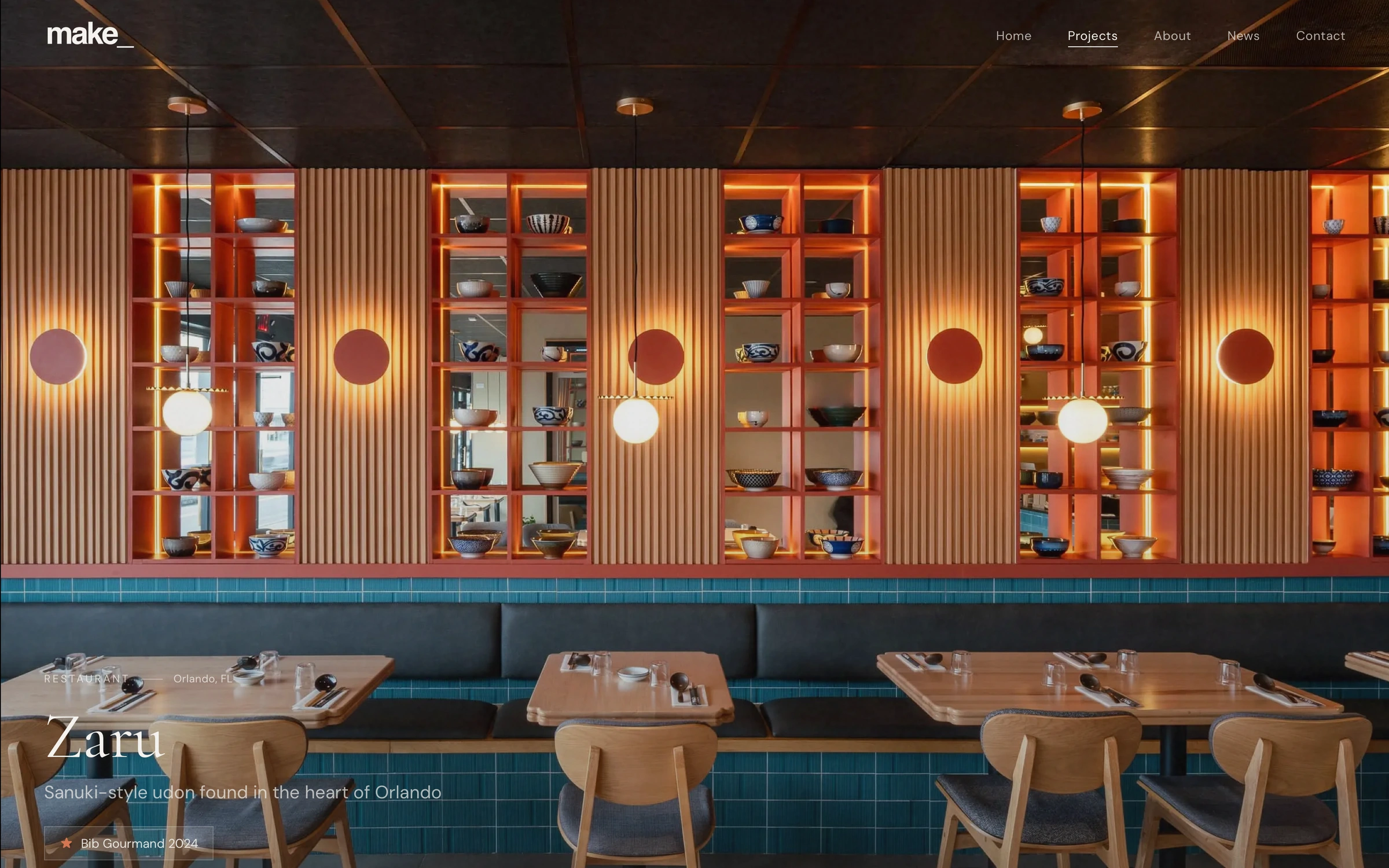
A project page opening on the restaurant ZARU
08A project page opens on the space itself.
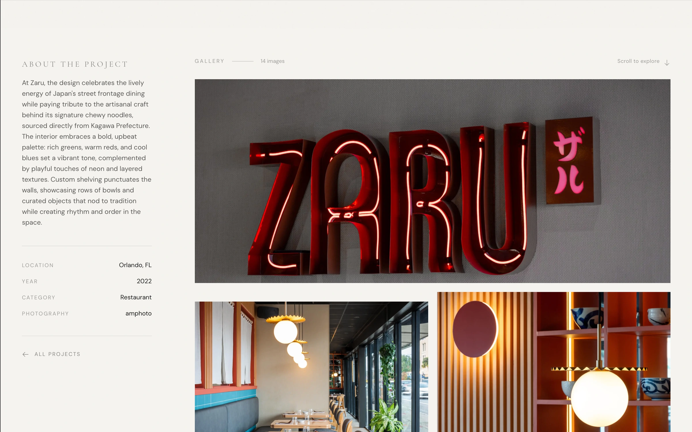
ZARU’s neon sign and a gallery of the restaurant’s interior

09

The gallery runs at full width: neon, brass, lacquer.

Your project

Have something like this in mind?

One decision-maker for strategy, design and engineering. Replies within 24 hours.
Get a quote
Selva Design LabNext case study